A UX designer and researcher who likes complicated problems.
My first example of user experience comes from my dad, an architect.
He was the first to show me how to consider the person using the space.
Each building, each room needs to work for the people inside. He would take me
through his projects as if we were the clients, to see how they were going to
experience the environment. Was it inviting? Was it functional? Where is the eye drawn?
How was the lighting? How did it make you feel?
I've always appreciated that viewpoint: putting myself in their shoes.
I think it's what makes me good at designing the user experience.
I was taught to think from many perspectives from a young age.
My professional background spans public health, field research, healthcare technology,
coaching, and product design. While those fields may look unrelated on paper,
they’ve all taught me the same thing: understand the people, understand the system,
figure out where the two aren’t working well together, and remove friction.
I earned a Bachelor's of Science in Public Health from the University of Illinois at Urbana-Champaign
where I developed a holistic,
system-level perspective on health, research and problem solving. It also istilled my values of consistency and
risk reduction. After college, I worked as a field researcher at the University of Wisconsin school of Medicine
and Public Health, conducting research with people in real-world settings and developing the skills to listen
carefully, ask good questions, and make sense of what I was learning.
I then moved into healthcare technology at Epic Systems Corp.,
where I worked with electronic medical records. I was a Quality Assurance tester
and my job was to thoroughly test my corner of the software to identify any bugs
before it got to production. I created and tracked testing plans, worked with
development teams to identify and resolve issues, and supported hospital staff
during software go-lives. That experience gave me an appreciation for the complexity
of healthcare systems and the importance of building technology that people can rely on.
I also got my first taste of UX design at Epic learning about different research methods
and usability techniques. In addition to my regular work, I used my French language skills
to aid the translation team translating the software into different languages to branch
into international markets. I have studied French from first grade through college
and loved getting to use those skills as well.
After Epic, I wanted to have a more personal impact in my work.
I spent 10 years working as a personal trainer and coach, both
independently and with fitness organizations. Although it was a different kind of
work, it deepened my understanding of human behavior. I learned how to meet people
where they are, understand individual needs, communicate complex information clearly,
and help people change their behavior. It also strengthened my ability to work independently,
build relationships, and help people turn information into action.
Eventually, I wanted to bring those empathy and project management skills into technology and work
on problems at a larger scale. I wanted more ownership over my work and to collaborate with a team.
I moved into UX and product design, eventually joining Ticket Attendant,
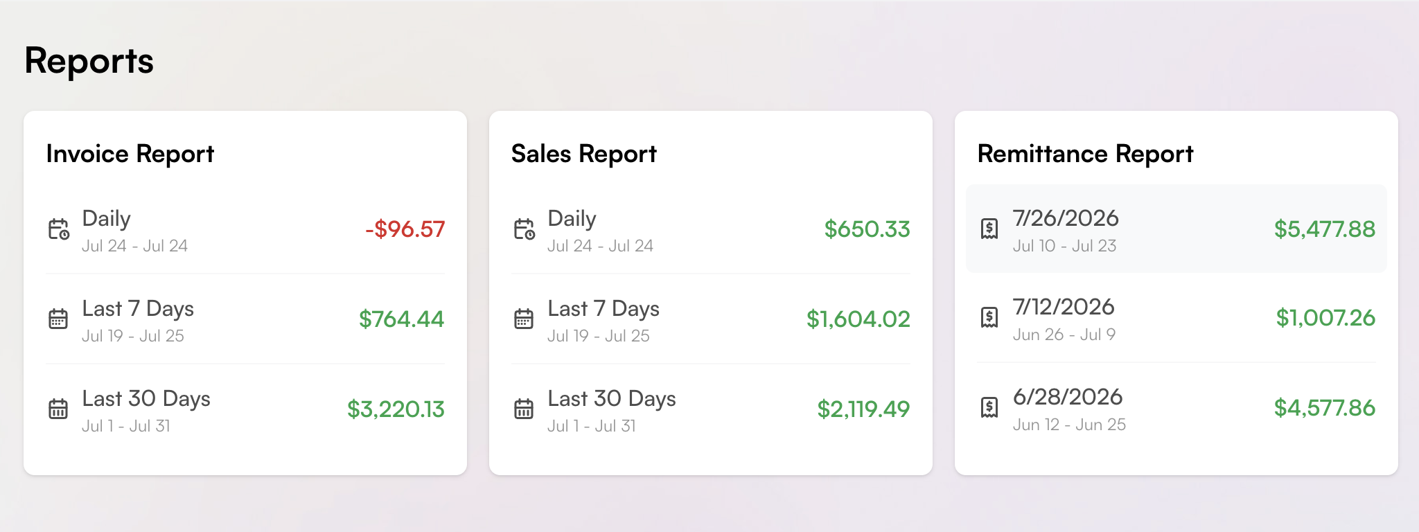
where I worked on a complex SaaS platform used by ticket brokers. There, I took projects from conception to execution, working
across research, design, testing, feedback, iteration, and rollout. I collaborated with engineering,
operations, and business stakeholders alike. The product involved large amounts of data and complicated
workflows, which reinforced something I’ve come to really enjoy about UX: understanding each user group and their specific needs is paramount.
Just like a personal training client, each has thier individual needs and starts from a different place. You must be nimble and adaptable to understand and
design the process for their unique needs.
That’s how I approach design today. I like asking why, understanding how a person or a system works beneath
the surface, and figuring out what people are actually trying to accomplish. I think the most important thing
is to make sure the problem the team is trying to solve is the right problem. Lots of time and effort can be
devoted to the wrong problem if you don't drill down to root cause first.
I bring research, systems thinking, creative problem solving, making sense of messy information, and turning ideas
into practicl reality. I've worn a lot of hats, all of them connected by communication, ideation,
relationship-building and getting things done. I even produced a fundraising aerial arts show and raised
$3,000 for charity.
My two years at Ticket Attendant gave me excellent experience takign a product from start to finish:
research, design, testing, feedback, iteration and roll-out.
I'll bring my curiousity, my self-starter personality, and all my human behavior understanding to whatever comes next.